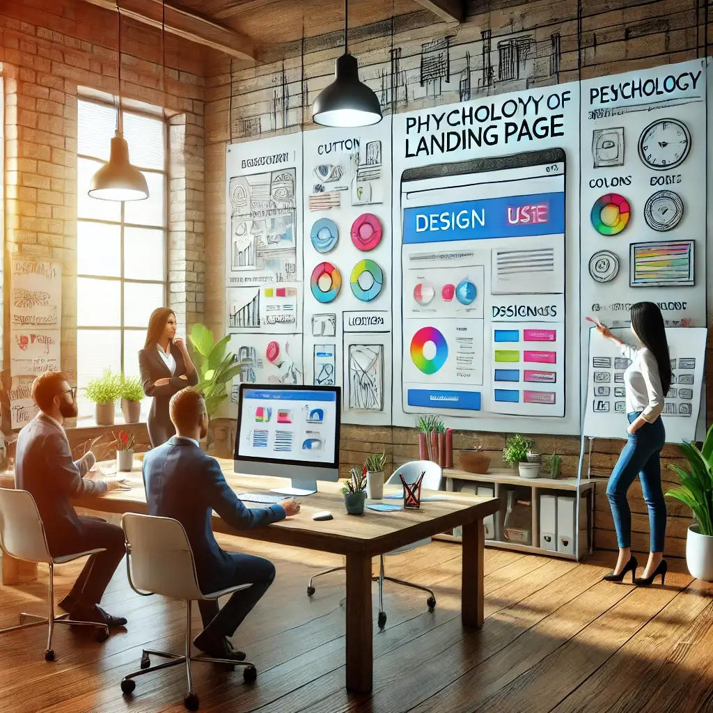
In the world of digital marketing, landing pages play a fundamental role in converting visitors into customers. But what makes a landing page truly effective? The answer goes beyond a beautiful design or well-written copy. It involves understanding the psychology behind user decisions.
Every element of a landing page – from color choices to button placement – can subconsciously influence visitor behavior. This is where design psychology comes in, an approach that combines visual strategies with behavioral principles to generate more clicks, engagement, and tangible results.
In this article, we’ll explore how to apply psychology in landing page design to optimize your conversions. You’ll learn what truly drives clicks, how to structure impactful pages, and which psychological techniques can turn curious visitors into loyal customers. Let’s get started!
What is Psychology in Landing Page Design?
Psychology in landing page design is the application of psychological principles to create pages that influence visitor behavior and increase conversions. It involves understanding how people make decisions and using that knowledge to structure a page that motivates specific actions, such as clicking a button or filling out a form.
Basic Concept of Design Psychology
Every element of a landing page – colors, copy, images, and layout – can impact how users interact with it. Design psychology focuses on creating experiences that are intuitive and pleasant, leading visitors to take the desired action effortlessly. For example, using vibrant colors can evoke positive emotions, while well-positioned CTAs make decision-making easier.
The Relationship Between Design and Emotional Decisions
Human decisions are not purely rational; they are strongly influenced by emotions. A design that conveys trust, urgency, or exclusivity can be more effective in engaging users. For example:
-
Trust: Security badges and testimonials reinforce credibility.
-
Urgency: Phrases like “Last chance” or “Offer valid today only” trigger the fear of missing out.
-
Exclusivity: Terms such as “Invite-only access” create a sense of privilege.
Why Psychology is Essential for Landing Pages?
In the digital environment, you have only a few seconds to capture a visitor’s attention. Applying psychology in design helps you make the most of these precious moments by creating impact and guiding the user to the next step of the sales funnel. By understanding what motivates and engages your audience, you can transform an ordinary page into a powerful conversion tool.
Design psychology in landing pages is not just a strategy; it is the foundation for creating pages that truly drive clicks and results.
Visual Elements That Convert
The visual elements of a landing page are crucial for capturing the visitor’s attention and driving action. They not only make the page more attractive but also play a significant psychological role in how users perceive and interact with the content. When used effectively, these elements can significantly boost conversions.
-
Colors and Their Emotional Impact
Colors have a direct impact on visitors’ emotions and behavior. Therefore, choosing the right color palette is essential to create a visual experience that drives clicks. For example:
-
Blue: Conveys trust and security, ideal for financial or professional services.
-
Red: Evokes urgency and energy, effective in CTAs or promotions.
-
Green: Relates to balance and health, great for wellness pages.
Additionally, contrast between the background and action buttons is crucial. A highlighted CTA button with a vibrant color, like yellow or orange, can draw more attention and encourage clicks.
-
Typography and Readability
Typography directly influences how content is perceived. Simple, clean fonts make reading more pleasant and faster, while overly decorative fonts can cause distractions. Practical tips:
-
Use large, clear fonts for headings and subheadings.
-
Limit the number of different font styles to maintain visual harmony.
-
Ensure line spacing promotes easy reading.
Readability is key to ensuring your message is quickly understood, especially on mobile devices.
-
Persuasive Images and Videos
Visual resources like images and videos have a unique power to engage visitors and convey emotions instantly. However, it is not enough to use any image; it must be relevant and high quality. Consider:
-
Real people images: Authentic photos of people using your product or service create stronger emotional connections.
-
Short explainer videos: A video explaining product benefits or showcasing its use can build visitor trust.
-
Avoiding overload: Ensure visual elements do not distract users from the primary goal.
-
White Space: Less is More
White space, or negative space, helps emphasize the most important elements of the page, such as the headline, main images, and CTAs. A “breathable” design provides clarity and prevents visitors from feeling overwhelmed with information.
Why Visual Elements Are Crucial?
Visitors decide in a matter of seconds whether to stay or leave the page. A visually attractive, well-structured design that uses colors, typography, and images strategically can create an intuitive experience, increasing conversion chances. Remember: first impressions matter, and your landing page design is your best opportunity to make an impact.
Psychology-Based Design Structures
Creating an effective landing page is not just about aesthetics; it’s about structuring each element to guide the visitor through a clear and intuitive journey. Psychology-based design structures help align visual and textual elements with natural user behavior, maximizing conversion chances.
-
Principles of Visual Hierarchy
Visual hierarchy is essential for directing the visitor’s attention to the most important elements on the page. It works by organizing elements so the eye is naturally guided. Some best practices include:
-
Highlighted titles: Use larger fonts and contrasting colors for key headings.
-
Progressive elements: Position information by importance, with the most relevant content at the top.
-
Call-to-action (CTA): Ensure the action button is centrally positioned and highly visible.
-
The Use of White Space
White space, also known as negative space, is a powerful design tool. It provides breathing room for the layout and helps focus attention on the most important elements. Benefits of effective white space use:
-
Facilitates content reading and comprehension.
-
Highlights CTAs and key messages.
-
Prevents the page from looking cluttered or confusing.
-
Strategic Call-to-Actions (CTAs)
CTAs are one of the most critical elements of any landing page. Psychologically, they should be direct, convincing, and visually appealing. To achieve this:
-
Use strong action verbs like “Download now” or “Sign up today.”
-
Position CTAs strategically, such as right after key information or at the bottom of the page.
-
Use contrasting colors to ensure CTAs stand out.
-
The F-Pattern and Z-Pattern
Eye-tracking studies show that users often scan pages in an F-pattern (for desktops) or a Z-pattern (for mobile devices). By designing with these patterns in mind, you can maximize content retention:
-
Place headings and subheadings along the scan lines.
-
Position crucial information at the end of the lines to capture attention.
-
Place CTAs at the final resting point of the Z-pattern.
-
The Power of Symmetry and Balance
A balanced design with harmonious proportions of text, images, and other elements creates a sense of order and reliability. Using the Rule of Thirds and the Principle of Symmetry can help achieve a more appealing layout.
Why Structuring Design is So Important
Design structures based on psychology ensure that navigating a landing page is intuitive and directed. When the page layout reflects natural visitor behavior patterns, barriers to conversion are reduced, allowing visitors to focus on what truly matters: the action you want them to take.
Using psychology in design is not just a trend; it is a necessity for creating more effective, result-driven experiences.
Psychological Techniques for Engagement
When creating landing pages that convert, understanding how to engage visitors is essential. Psychological techniques can be used to capture attention, create emotional connections, and, most importantly, drive the visitor to take action. Below are some of the most effective techniques to increase engagement.
The Effect of Scarcity and Urgency
Scarcity and urgency are powerful psychological triggers that encourage visitors to act quickly. They create a sense that an opportunity may be lost, which drives decisions. Practical examples include:
-
Countdown timers: “Offer ends in 2 hours!”
-
Limited availability: “Only 3 units left.”
-
Exclusive promotions: “Valid only for the first 50 buyers.”
These messages encourage immediate action, reducing procrastination.
Social Proof and Trust
People tend to trust products or services that others have already approved. Social proof validates quality and builds confidence for the visitor. How to apply:
-
Customer testimonials: Include positive statements from satisfied users.
-
Impressive numbers: “Over 10,000 happy customers.”
-
Certifications and security seals: Reinforce credibility with visual guarantees.
Showing that others have trusted you helps build trust and reduce objections.
The Principle of Reciprocity
When you offer something valuable for free, people feel more inclined to give back. This can be applied on landing pages through:
-
Free e-books: “Download our exclusive guide now.”
-
Trial periods: “Try free for 7 days.”
-
Useful resources: Tools or spreadsheets that help the visitor with their needs.
By delivering value first, you build a trust-based relationship that can lead to conversions.
The Power of Simplicity
Decisions are easier to make when options are limited. A landing page overloaded with information or choices can confuse visitors. To maintain engagement:
-
Focus on a central message: Highlight the primary benefit of the product or service.
-
Avoid distractions: Remove unnecessary elements that divert attention.
-
Single call-to-action: Focus on one clear action, such as “Sign up now.”
A simple experience reduces frustration and encourages action.
Emotions as Catalysts
Emotions play a central role in decision-making. Using emotional appeals in messages and visuals can create a lasting impact. Examples:
-
Joy: Show how the product will bring happiness and satisfaction.
-
Fear of missing out: Highlight the consequences of not acting.
-
Aspiration: Inspire visitors by showing how they can achieve their goals.
Emotionally connecting with visitors makes your page more memorable and persuasive.
Consistency and Commitment
Starting with a small action can lead visitors to a greater commitment. This psychological principle is known as “foot-in-the-door.” Examples:
-
Micro-commitments: “Sign up to receive updates.”
-
Progressive steps: Divide the conversion process into simple steps, like asking for a name first and then additional details.
Small steps build trust and make the visitor more likely to complete the final action.
The Familiarity Effect
People are drawn to what feels familiar. Incorporating recognizable elements in your landing page design can create an instant connection. Examples:
-
Familiar colors and logos: Maintain consistency with your branding.
-
Cultural references: Use images or phrases that resonate with the target audience.
Familiarity generates comfort, increasing the likelihood of engagement.
Engagement That Drives Results
By applying these psychological techniques, you not only capture visitors’ attention but also keep them engaged and confident enough to take action. Every detail of your landing page – from messages to visuals – can be designed to align with the psychological principles that drive people. When design speaks to both the mind and the heart of the visitor, the result is clear: more clicks, more conversions, and greater success for your digital strategy.
A/B Testing: Discovering What Works
In the world of landing pages, small details can make a big difference in conversions. From the color of a button to the wording of a call-to-action (CTA), everything can influence visitor behavior. This is where A/B testing comes in, a crucial tool for discovering what truly works.
What is A/B Testing?
A/B testing is an experiment where you create two versions of a landing page – version A and version B – and present them to different visitor groups. The goal is to compare the performance of each version to identify which one generates better results, such as clicks, form completions, or sales.
Why is A/B Testing Important?
In landing page design, decisions based solely on intuition or personal taste may not be the most effective. A/B testing allows you to:
-
Make data-driven decisions: Discover what truly works based on visitor behavior.
-
Improve user experience: Adjust elements to make navigation smoother and more intuitive.
-
Increase conversions: Continuously optimize your page for better results.
Ideal Elements to Test
Almost everything on a landing page can be adjusted and tested. Some of the most common elements include:
-
Headlines and subheadings: Test different styles and messages to capture attention.
-
CTA buttons: Experiment with colors, sizes, text, and placement.
-
Images and videos: Assess the impact of different media types.
-
Forms: Test the number of fields and ease of completion.
-
Offers: Alternate between discounts, gifts, or free trial periods.
How to Run Effective A/B Testing
-
Define a clear goal: Choose what you want to measure – clicks, sign-ups, purchases, etc.
-
Test one variable at a time: For accurate results, change only one element per test.
-
Use a significant sample: Ensure the test reaches enough visitors for reliable results.
-
Monitor and analyze: Use tools like Google Optimize, Optimizely, or VWO to collect data and evaluate results.
-
Implement improvements: Apply the changes that showed better performance and keep testing.
A/B Testing as an Ongoing Strategy
A/B testing is not a one-time event but a continuous process. User preferences and design trends change over time, so regular testing is crucial to keep your landing page effective. With this data-driven approach, you can turn your page into a conversion machine, ensuring progressively better results.
Remember: testing is the key to optimization. Never underestimate the impact of a small adjustment based on real insights!
Conclusion
Creating an effective landing page is more than just about aesthetics; it involves deeply understanding how visitors think, feel, and act. By applying design psychology principles, you can transform an ordinary page into a powerful conversion tool, capable of capturing the audience’s attention and guiding them toward the desired action.
In this article, we explored the importance of visual elements, such as colors and typography, as well as design structures that optimize navigation and psychological techniques that drive engagement. We also examined the impact of continuous adjustments using A/B testing and showcased practical examples of landing pages that truly work.
Remember, success lies in paying attention to details. Small changes, such as adjusting the position of a button or the color of a CTA, can yield significant results. However, the most important factor is always focusing on your audience’s needs and expectations.
Now it’s your turn: apply these strategies, test constantly, and refine your design based on data. The journey to increasing your conversions begins with understanding what truly drives clicks. Your landing page has the potential to be the next success story!
FAQ (Frequently Asked Questions)
1 – What is a landing page, and why is it important?
A landing page is a page designed with a single goal: to convert visitors into leads or customers. It is important because it eliminates distractions and focuses on a specific action, such as filling out a form, clicking a button, or making a purchase.
2 – How do colors influence conversions on a landing page?
Colors have a significant psychological impact. For example:
-
Red: Evokes urgency and stimulates action.
-
Blue: Conveys trust and security.
-
Green: Relates to balance and growth.
Choosing colors that align with the message and target audience can increase conversions.
3 – Which elements should be prioritized in landing page design?
Key elements include:
-
A clear and attractive headline highlighting the main benefit.
-
A prominent and well-positioned CTA.
-
Social proof, such as testimonials or customer numbers.
-
High-quality images that reinforce the message.
4 – What is A/B Testing, and how does it help?
A/B Testing is an experiment comparing two versions of a landing page to determine which one performs better. It helps identify which elements generate more engagement and conversions, enabling adjustments based on real data.
5 – How can I apply urgency to my landing page?
You can create urgency by using:
-
Countdown timers: “Sale ends in 24 hours.”
-
Limited offers: “Only 5 units available.”
-
Exclusive deadlines: “Valid only until today.”
6 – What should I avoid on a landing page? Avoid:
-
Excessive information or elements that cause distraction.
-
Multiple CTAs that confuse the visitor.
-
Disorganized or difficult-to-navigate design.
-
Long and complicated forms that discourage completion.
7 – How long does it take to optimize a landing page?
The optimization process is ongoing. A/B testing, metric analysis, and adjustments should be made regularly.
Often, small changes can yield significant results within a few weeks, but continuous improvements are essential to keep up with audience needs and market trends.