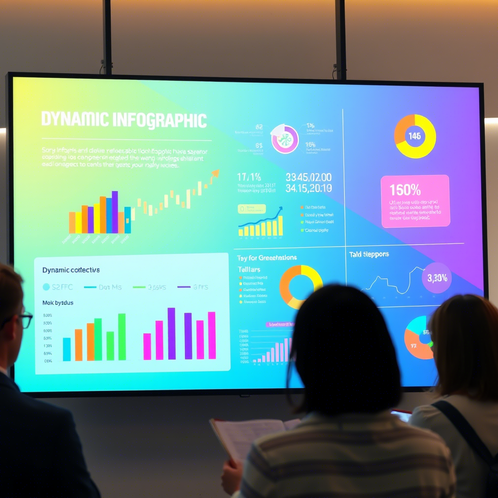
In today’s fast-paced world, where information is abundant and attention spans are shrinking, finding ways to communicate complex ideas effectively has become more important than ever. Enter infographics—a visual tool that transforms dense data into digestible content.
Whether you’re a business professional, educator, or content creator, mastering the art of infographics can revolutionize how you present information. In this article, we’ll explore why infographics are so powerful, how they simplify complexity, and how you can leverage them to enhance communication. Let’s dive in!
Why Infographics Are Essential for Modern Communication
Humans are naturally drawn to visuals. Studies show that 90% of the information transmitted to our brains is visual, making it easier for us to process images over text alone.
This inherent preference makes infographics an invaluable asset when dealing with intricate topics. Instead of overwhelming your audience with paragraphs of text, infographics break down information into bite-sized chunks, using colors, icons, and charts to convey meaning quickly.
For example, imagine trying to explain global carbon emissions trends through a lengthy report versus an infographic showing a timeline with clear graphs and comparisons. The latter not only saves time but also ensures better retention. Research suggests people remember 65% of visual information after three days, compared to just 10% of what they hear.
Infographics are especially useful in fields like science, finance, and technology, where numbers and concepts can be intimidating. By presenting these elements visually, you make even the most complicated subjects accessible to everyone.
How Infographics Enhance Understanding
One of the primary reasons infographics work so well is their ability to tell a story. When done right, an infographic takes the reader on a journey from problem to solution—or from question to answer—all within one cohesive design.
For instance, if you’re explaining the benefits of renewable energy, you could use an infographic to highlight key statistics, such as cost savings, environmental impact, and job creation, all while maintaining a logical flow.
Additionally, infographics help combat cognitive overload. When faced with too much information at once, our brains struggle to focus. Visuals reduce this burden by organizing data hierarchically. Important points stand out through size, color, and placement, guiding the viewer’s eye naturally.
Let’s consider another real-world application: health awareness campaigns. A campaign about heart disease might include an infographic illustrating risk factors, symptoms, and prevention tips. Such a resource is far more engaging—and actionable—than a pamphlet filled with small print.
Practical Applications Across Industries
From marketing to education, infographics have proven their versatility across industries. Businesses use them to showcase product features, market research findings, and company milestones. Marketers often employ infographics in social media posts because they perform exceptionally well, receiving twice as many shares as other types of content.
Educators benefit greatly from infographics as teaching tools. Imagine a history teacher creating an infographic summarizing major events during World War II. Students would find it easier to grasp timelines and relationships between historical figures than reading a textbook chapter.
Even nonprofits and advocacy groups rely on infographics to raise awareness. For example, organizations fighting hunger may create an infographic comparing food waste statistics globally to drive action among donors and volunteers.
By tailoring designs to specific audiences, infographics ensure maximum engagement and comprehension. They bridge gaps between technical knowledge and everyday understanding, empowering individuals regardless of their expertise level.
Design Tips for Effective Infographics
Creating impactful infographics requires both creativity and strategy. Here are some practical tips to get you started:
Know Your Audience : Understand who will consume your infographic. Tailor the language, visuals, and structure accordingly.
Keep It Simple : Avoid cluttering your design with unnecessary details. Focus on clarity and relevance.
Use Consistent Colors and Fonts : These elements contribute to brand identity and readability.
Leverage White Space : Don’t fear empty areas; they provide balance and prevent overwhelm.
Tell a Story : Organize information sequentially, leading the viewer from start to finish.
Tools like Canva, Venngage, and Piktochart make designing infographics effortless, even for beginners. With drag-and-drop interfaces and pre-made templates, anyone can produce professional-quality visuals without needing advanced graphic design skills.
Moreover, incorporating interactive elements—such as clickable sections or animations—can elevate your infographics further. Interactive infographics engage users actively, encouraging exploration and deeper learning.
Measuring Success and Continuous Improvement
Once you’ve created an infographic, measuring its success is crucial. Metrics like page views, shares, and conversion rates (if applicable) indicate whether your message resonated with your audience. If performance falls short, analyze potential issues, such as unclear messaging or unappealing aesthetics.
Continuous improvement involves staying updated with design trends and user preferences. Regularly seek feedback from peers or target audiences to refine future creations. Remember, the best infographics evolve alongside the needs of those consuming them.
Consider testing different formats or layouts to see which works best for various contexts. Perhaps a vertical layout performs better on mobile devices, whereas horizontal designs suit desktop presentations. Experimentation leads to innovation and better outcomes.
Conclusion: Unlocking the Potential of Infographics
Infographics aren’t just pretty pictures—they’re powerful tools capable of transforming how we share and absorb information. From simplifying complex data to enhancing storytelling, their applications span countless domains. As demonstrated throughout this article, infographics save time, improve retention, and foster connection with diverse audiences.
Now that you understand their value, take action! Start experimenting with infographic design today. Share your creations online, gather feedback, and refine your approach. Who knows? You might inspire others to adopt this versatile medium.
Before you go, we’d love to hear from you! What challenges do you face when communicating complex information? Have you tried using infographics before? Leave a comment below or share this article with someone who could benefit from it. Together, let’s harness the power of infographics to make knowledge accessible to all.


